I am so excited about the start of the Olympics tonight! Do you get the Olympic fever like I do? For the next two weeks I will be hiding out from the sweltering New York City heat and watching every possible event I can squeeze into my day. But I will also be watching for more than the sporting events; I will be glued to the tv to check out the visual identity of the games too! Want to a see a (monster) preview of all things design-related for the Olympics? Follow me after the jump . . .
As you may know, I have long studied the design elements of the Olympic Games; it's a fascinating topic! So I thought it would be fun to give you my reactions, compared to past Olympic designs, to this year's set up. Ready? On your mark, get set, let's go!
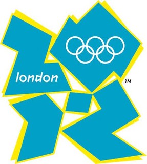
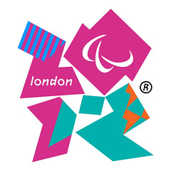

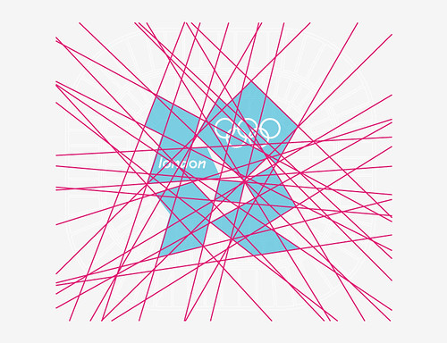
The logo for these games was unveiled in 2007 to great debate. There were complaints that it was too angular, while others thought it resembled some sort of offensive imagery. Personally I just think (like much of the identity) that it is simply trying too hard to seem cutting edge and futuristic. Simplicity in design is highly underrated and could have been useful in higher doses for the designers here. Still, the logo has grown on me in the past couple years.
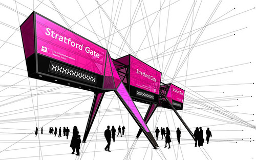

Here, with the wayfinding signage, is an example where the futurism of the design doesn't seem so bad. As we learned from the 1968 Olympics in Mexico City, having distinctive and colorful signs is one of the most concrete ways to establish the "look" of the event and welcome visitors. Whereas the vector lines in the blue and pink logo above don't really work, I think they make for a pretty cool overhead sign here.
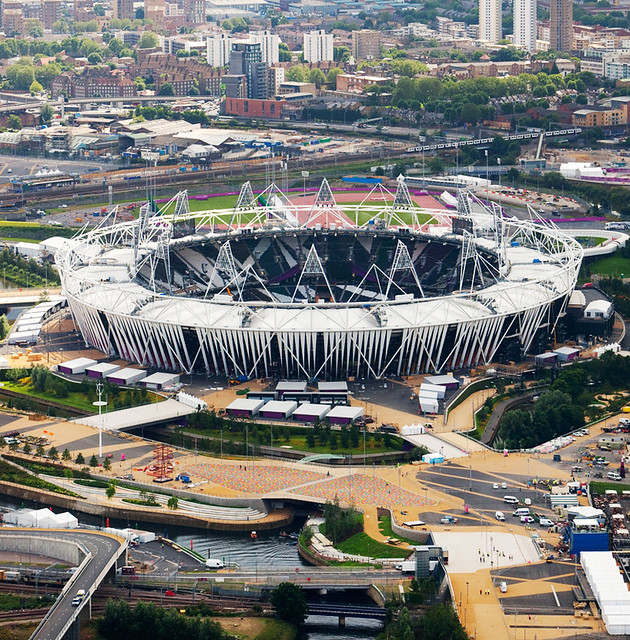
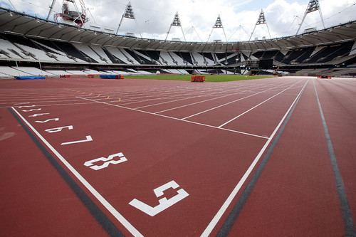
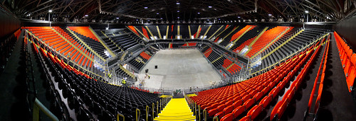
The same angularity has been tied into the stadium designs too. Personally I am not crazy about the spikes sticking out of the track stadium in London (the 'bird's nest' in Beijing was much more cohesive and beautiful) but I applaud the way the fractured look has been continued to the side of the building and into the paint scheme of other venues.
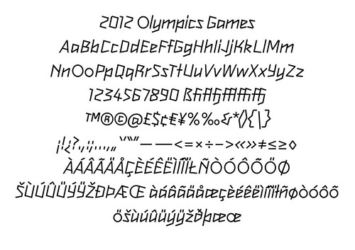
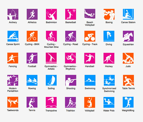
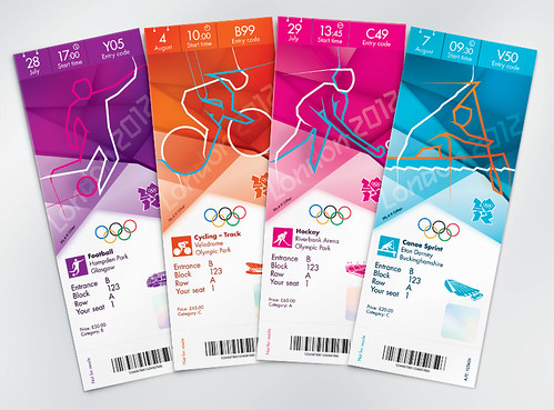
The graphics—the font, color palette, and pictograms—all seem a little over the top to me too. Lots of '80s colors (namely magenta and neon purple!) and angular lines. Like Mexico City 1968 again, they designed their own typeface for the Games but, unlike Mexico City, the typeface is rather hard to read and overly complicated. Also, who thought that drawing cartoon-like speed lines behind the drawings of the athletes (as in the tickets above) would seen edgy and cool? It comes off pretty lame and ruins the simplicity and legibility of the figures, which is their primary function.
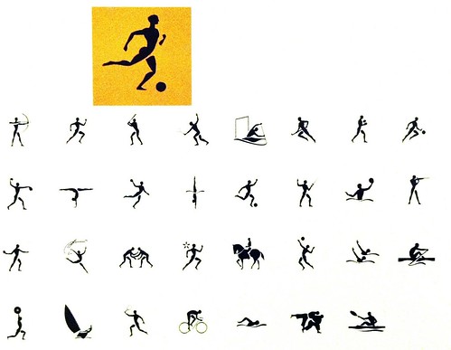
They look remarkably like exaggerated (read: distorted) versions of the pictograms used in the Atlanta 1996 Olympics (above) . . . no?
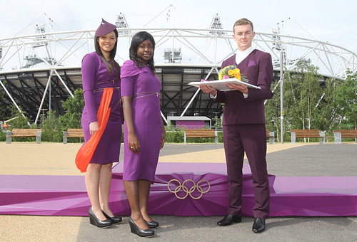
Another example where the sweeping angularity may have been taken too far. What's with that pointy hat she's wearing?!
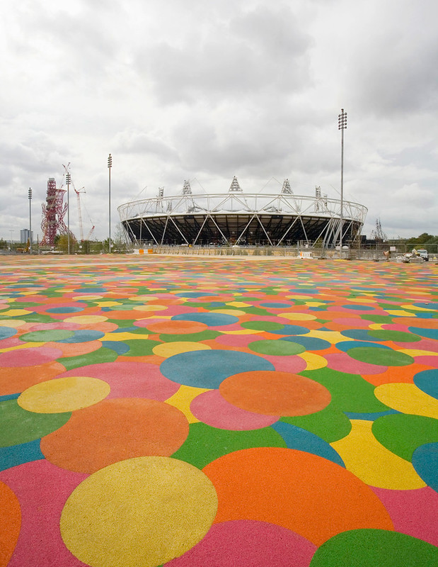
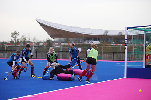
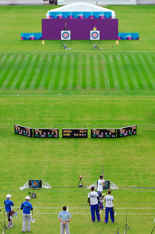
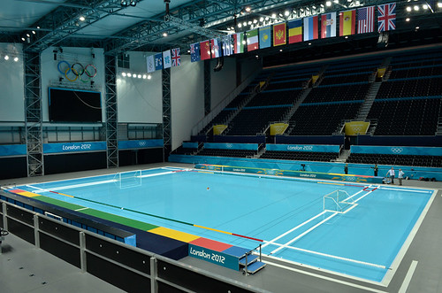
While I am not 100% behind the main color palette they have chosen, I do love how widespread their use of bright swathes of chroma has been. Weirdly enough the polka dotted courtyard above is not my favorite (despite my undying love for polka dots) because it uses too much, not quite right color at once; much more effective are the fields and courts where bright blocks of only two or three colors have been laid out. For example, this is apparently the first time that an international field hockey competition is being played on a field that is not green (the Olympic field this year is blue and magenta!). I am sure that will pop on tv!
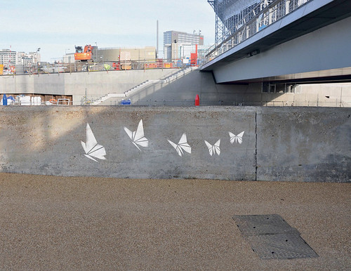
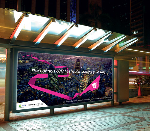

One instance where the angular, futuristic identity works really well is with the Cultural Olympiad (for the uninitiated, the cultural olympics are a series of exhibitions, performances and artistic events held in conjunction with the games in the host city). I really think the stenciled logo and serpentine ribbon imagery in the ads worked well; it looks cool and inventive without being over the top. Just what you want from a design identity: clarity, chicness and visual interest!
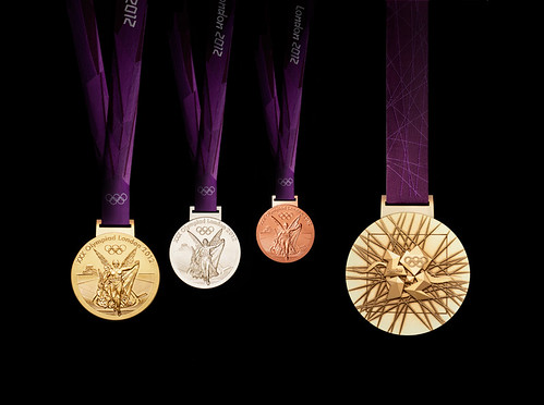
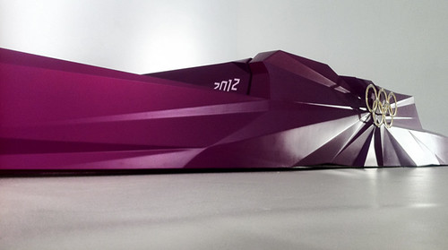

Luckily the same care and restraint has been instilled in the most iconic aspects of the games like the torch, medals and podiums. The eggplant-colored, multi-faceted podiums look regal and sleek without being cheesy or garish; similarly the medals look interesting without being too overwrought; but, above all, the torch they have designed is incredible. It is apparently made from a golden aluminum alloy and has 8000 tiny holes in it to represent the 8000 torch bearers that will carry it in the lead up to the games. It was designed by the firm barberosgerby and you can find out much more information about it here. I am floored. It looks absolutely stunning all lit up, no?
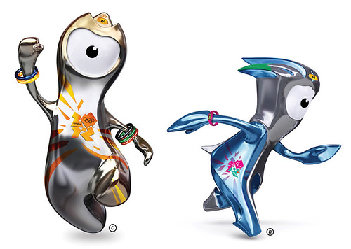
Still, even the most beautiful of torches cannot make up for these horrendous mascots. We have had some bad mascots in the past but, seriously, what the hell are these guys besides a perfect example of how much Olympic design teams can miss the mark? Please, please, please, let us get back to real animals! Would it be so wrong to have an actual animal (maybe a corgi as a nod to the Queen?) from the home country as the mascot?
Get much more information about the design identity of the London Olympics in this amazing design boom post here.
(all images from design boom except the blue logo at top (from here) and the pictograms from the Atlanta Games (from me))
No comments :
Post a Comment