Hi all! How was your weekend? I had a fabulous time in Toronto and my presentation on Friday went super well. I got some great feedback and am looking forward to refining my text, presenting it again and trying to get it published. All good, right?
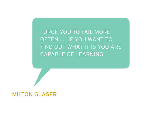
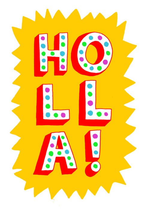
I still have to give you guys a sneak peak into my argument for the paper—I can promise I will do that tomorrow! Until then, I am using this awesome hand-drawn text by Brad Simon (taken from his Tumblr series here; found via OK Great here) to give myself a proverbial pat on the back. Is that too much? Either way, I needed an excuse to post his awesome type drawings; brighten up your Monday and go check them out!