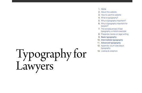
I think it is clear that I am a geek for typography. Just look at these posts. But recently, upon discovering the amazing website 'Typography for Lawyers', I realized I don't know quite as much about typography (and its proper usage) as I think. For instance, did you know that the two-space rule after the period is a hold over from the typewriter era? Or the difference between an n-dash and an m-dash . . . and why they are called that?
While the website is directed to lawyers, it's guidance can really be helpful to pretty much any professional.
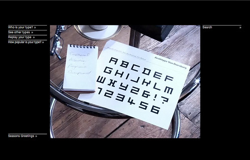
Along the same vein, I thought I would point you in the direction of Pentagram quiz: What Type Are You? By answering a few short questions—all posed by a mysterious, European, psychologist-like figure—the site will help you determine what typeface best suits your personality. It turns out I don't actually like the look of my typeface that much—Architype Van Doesburg—but I do completely agree with the explanation aligning its characteristics with my beliefs and views.
(And thanks for reminding me about it Caitlin!)

No comments :
Post a Comment