I am super behind on my National Stationery Show recaps. I'm sorry! Somehow being on summer vacation is a big time commitment!
(This is the second to last recap and then we will fully return to our regularly scheduled programming . . . )
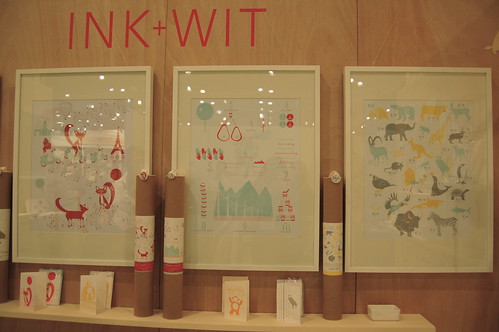
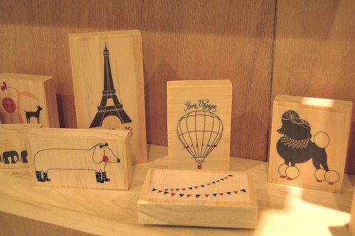
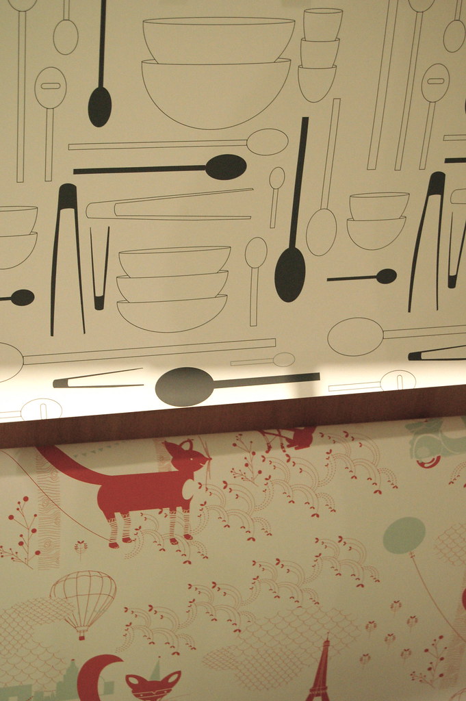
I had a great time talking with Tara at the lovely Ink + Wit booth. I loved her bright combos of light blue and red, interspersed with adorable animals and alphabet prints. Even so, the feeling behind Ink + Wit is sophisticated, fresh and modern. I would love to receive a present wrapped in one of their lovely papers and would absolutely die to own a set of the 'Paris'-themed rubber stamps. See more eye candy and inspiration here.
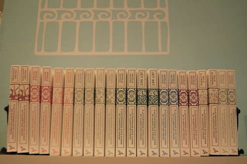
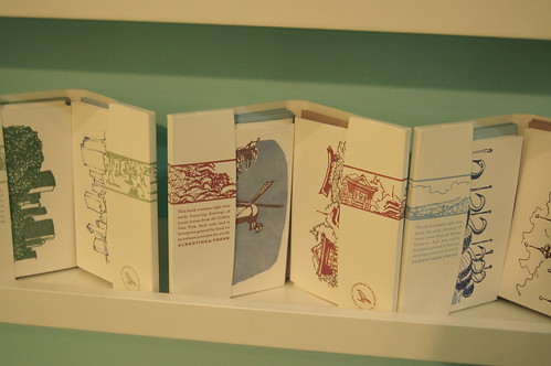
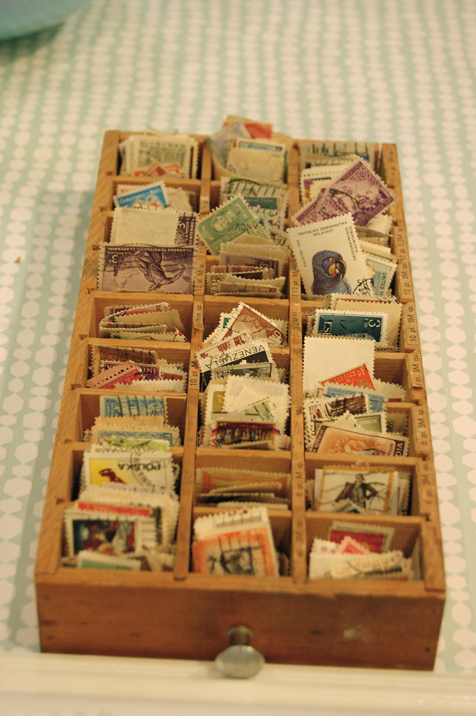
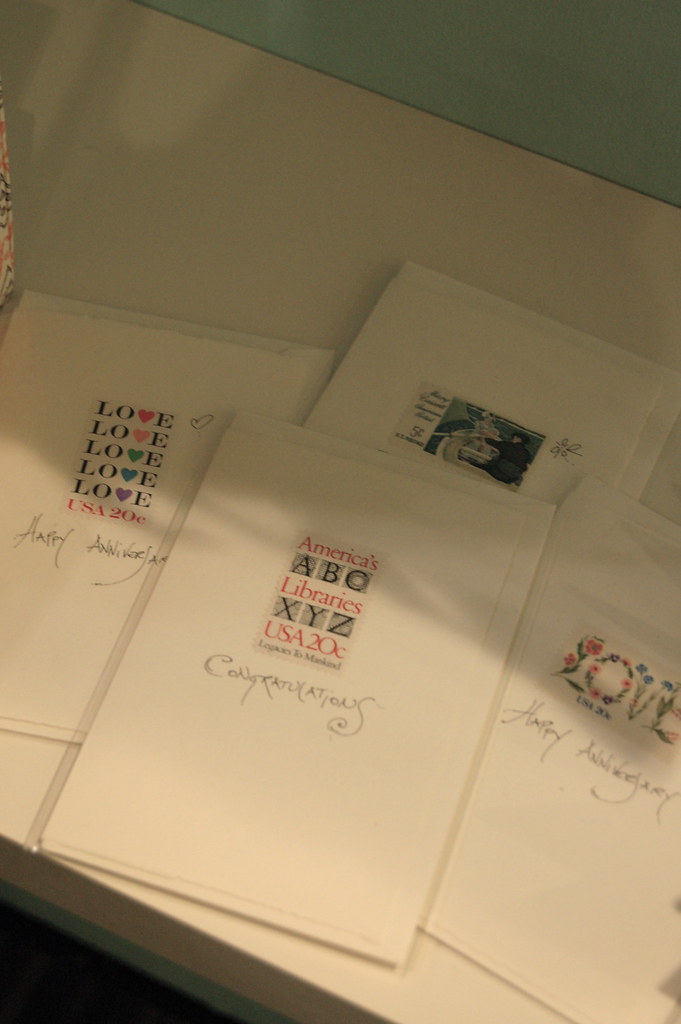
Another super source of eye candy was the booth featuring Boston-area Albertine Press and Carta Inc. The booth was beautifully decorated with light blue walls and bright white frames, all around paper products festooned with vintage stamps. They even encouraged visitors to page through their stamp collection and take a few samples with them! I left the booth with a tiny glassine envelope filled with stamps: a fabulous marketing tool and super-cool giveaway!
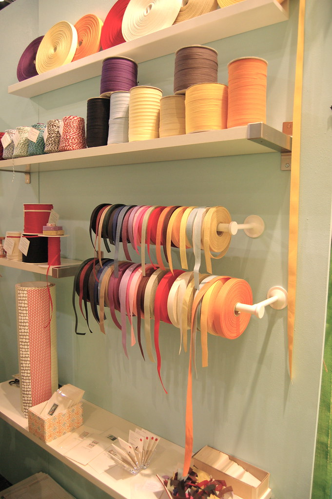
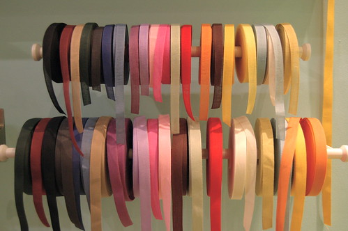
Accordingly, both studios are very inspired by vintage ephemera and stamps. Albertine had a huge display of card sets with brightly colored letterpress illustrations that reminded me of 1950s-era encyclopedias. I love the way they look in a row on a book shelf--so pretty! Angela Liguori's side (Carta Inc.) featured spools of beautiful Italian cotton ribbon and hand-lettered cards with vintage stamps. All in all, everything from both studios looked bright and fresh and visually stunning. I would highly recommend a visit to the Albertine website here and the Carta Inc site here.
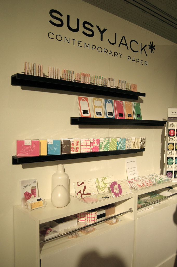
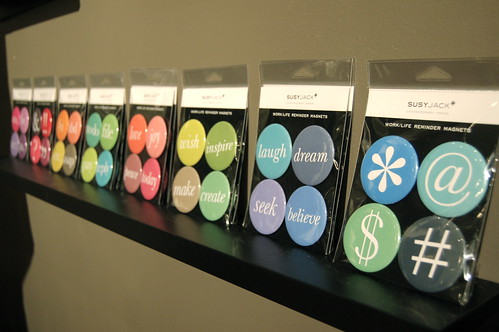
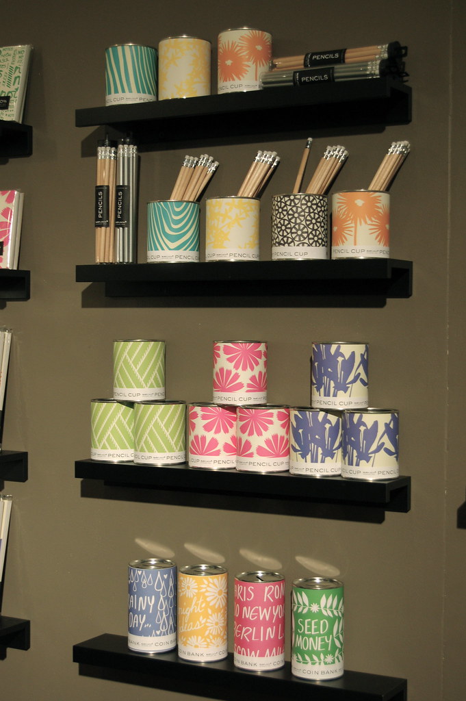
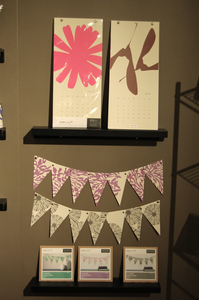
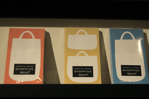
Another huge locus of inspiration and visitor buzz was the susyjack* booth. I had an amazing chat with owner and designer Susan Connor (who writes one of my favorite blogs, heysusy*, here), who kindly spent a long time sharing some of her trade secrets with me. And boy is she on point! Every single product in the susyjack* line fits into a unique style: bold, graphic shapes and clean, bright colors. I was almost giddy to see some of her new goods; I love the shopping bag note pads (perfect for grocery lists!), the paper pennants/garlands, and the growing line of magnets. Lovely, lovely, lovely. Check out more here.
The final NSS post will be on Thursday. Thanks for bearing with me!
No comments :
Post a Comment