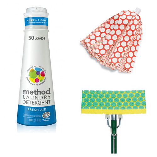
I have noticed a lot of cleaning products are starting to feature really bold designs, especially polka dots. I saw a commercial for this Method laundry detergent last week and I almost fell over at the sight of their new 'dotty' logo. I LOVE the brightly colored overlapping circles and would probably wallpaper my whole apartment with that pattern if my boyfriend would let me (though really a pillow or two might be kinder on the eyes and look better with my couch). I also LOVE the red and white polka dot pattern on the new Libman wonder mop (I feel like a commercial voice-over just typing that). The old mop only had the small dot pattern, now seen on the inside. The new mop uses the scale of the polka dots to represent different absorbencies in the fabric, giving bigger dots to the more absorbent strips on the outside. The result is a bright modern twist on an otherwise retro 1950s-era pattern. Awesome! This dot patten has also been used for the scrubbers of this green and yellow mop -- a clever and attractive solution to the intersection of form and function.
If you are interested in buying these prettily designed cleaning products check out the Method website here and the Libman website here.
I, too, love the Method logo! If I have to clean, at least give me fun tools, right?
ReplyDelete